
Logos and Branding
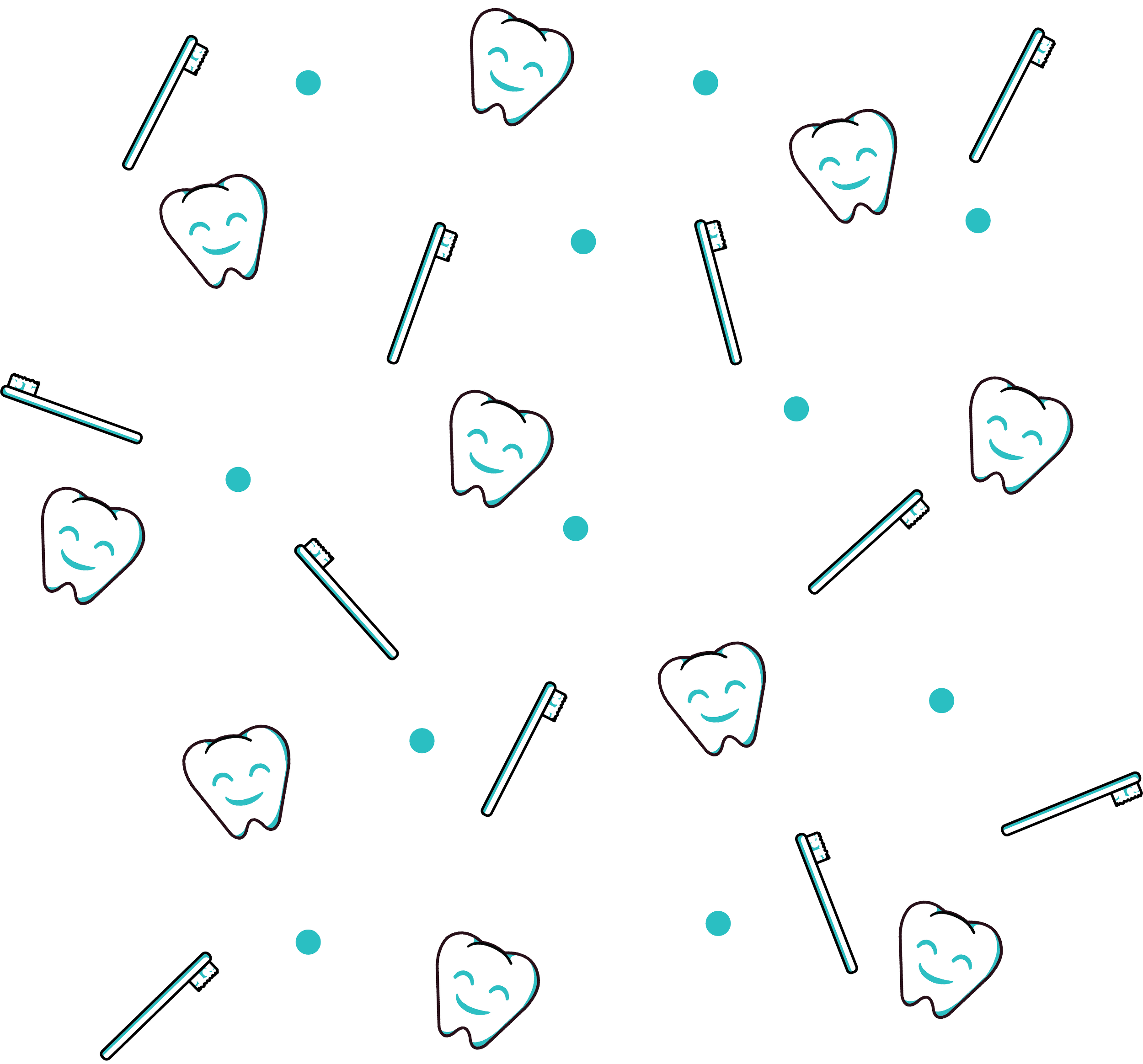
Dental Migo
Logos, patterns, and mockups created for a Washington University Student’s business pitch. Dental Migo is a dating app inspired application that helps people find effective personal dental care by allowing them to match with dentists that meet their criteria.
Client
Washington University Business Students
Year
2023


artist’s logo set
-
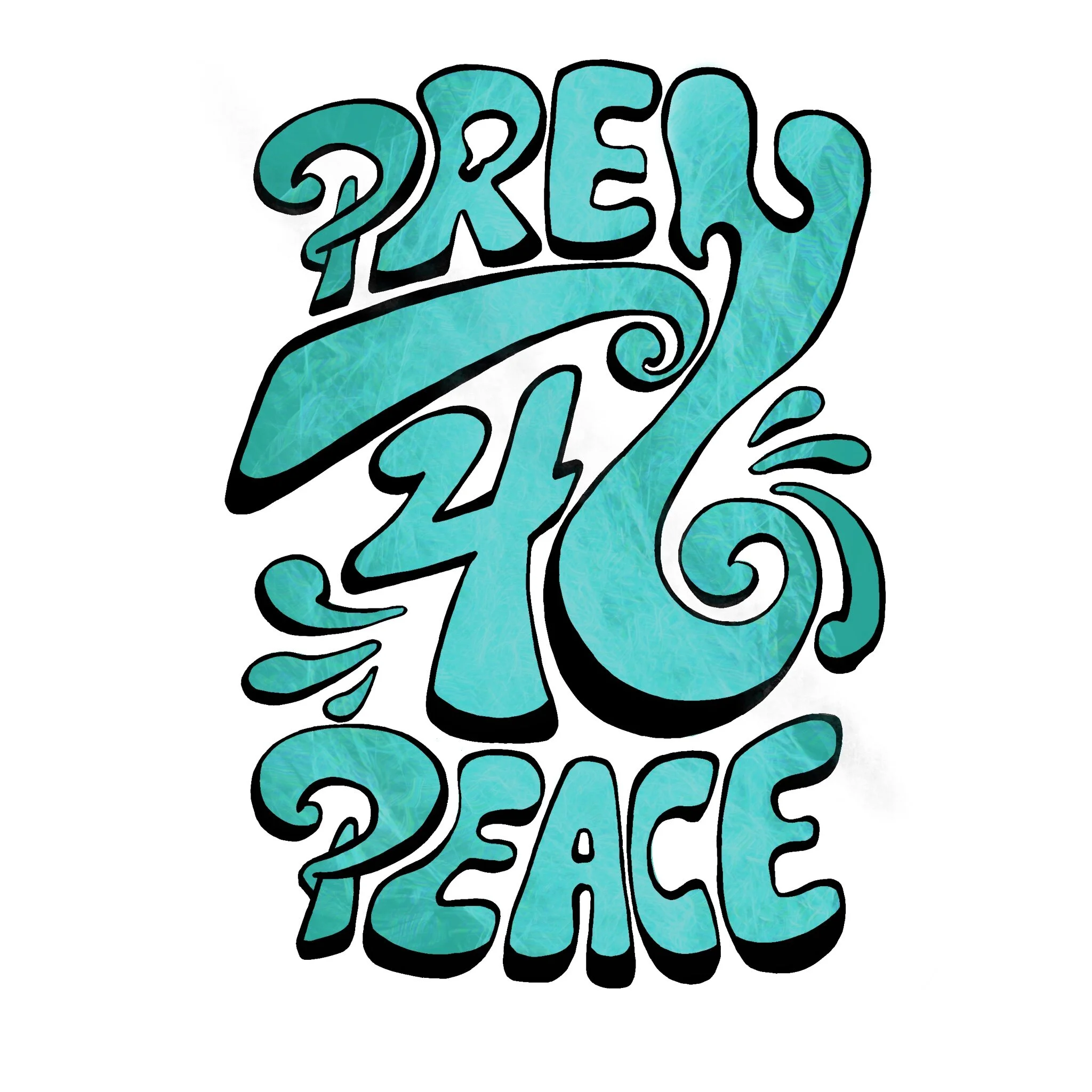
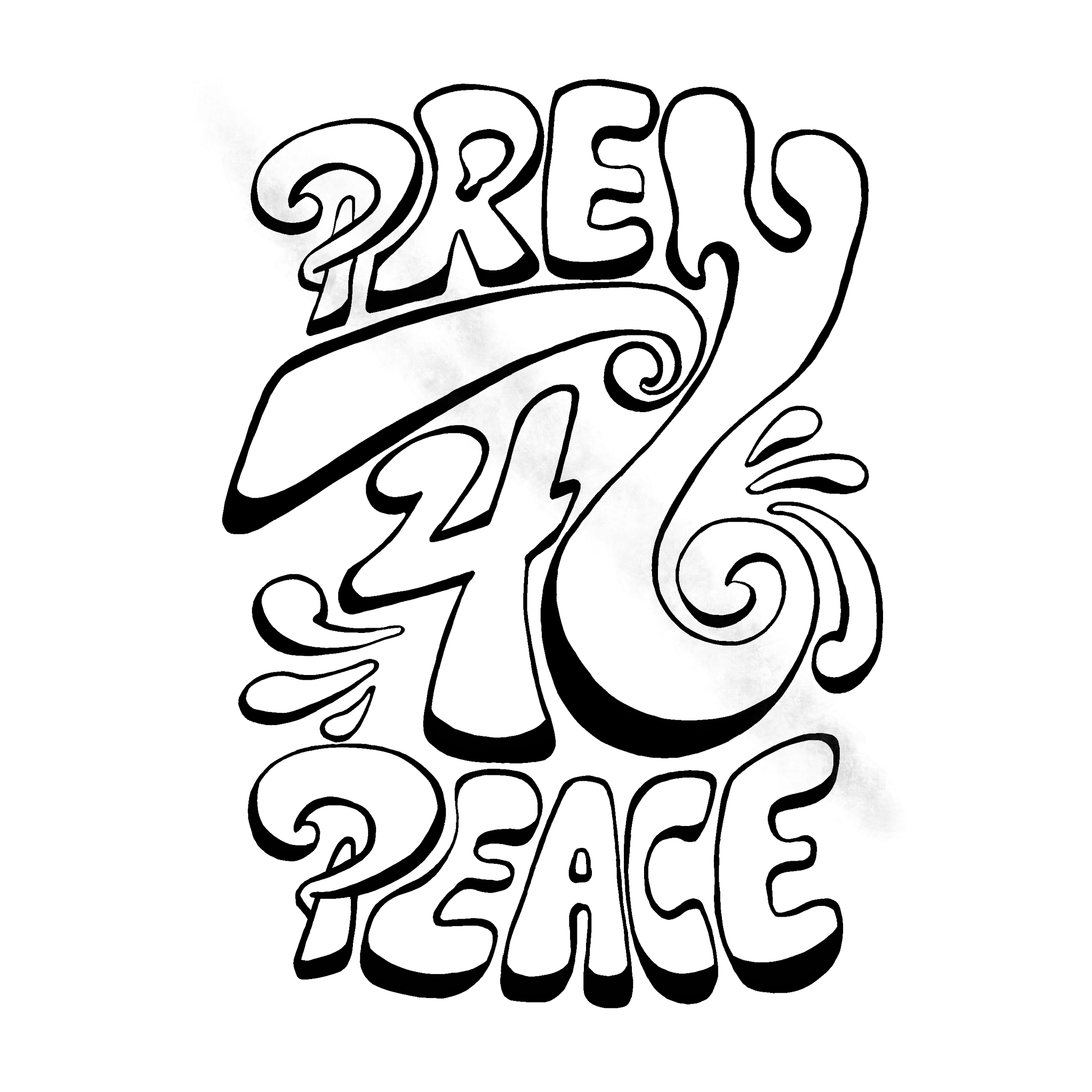
A local St. Louis artist contacted me for help creating an original collection of logos to use on her social media page and business cards. She requested a typographic logo that featured her business’ name, Prey 4 Peace. Stylistically I collaborated with her to incorporate design characteristics that reflected both her personal tastes and her brand’s eclectic free-flowing nature.
The finalized set of logos ( as seen below) provides several options to suit a variety of needs that she may encounter as her business evolves. These visual assets take inspiration from Psychedelia, Graffiti, and Art Nouveau. In this collection I provided her with options consisting of linework, multi-color gradients that incorporated both primary colors as well as an electrifying combination of teal and pink, teal marbling, and exquisite gold glitter.


artist’s logo
-
When working through a rebrand for my own creative business I decided that it was time to upgrade my logo. My original logo ( example A) is shown below. Upon some reflection I concluded that it was a bit busy and difficult to read with the watercolor gradient that I included in its design. With so many strong straight lines, it felt titanic and overbearing which did not align with the air of approachability and fastidious attention to detail that I strive for in my work.
For my revision ( example B below) I created a monochrome linework version using my initial. I chose to utilize a more minimalistic style while incorporating a paintbrush-like detail to reflect my main medium, which is painting. This logo accomplishes two goals that my first did not: 1) it has higher legibility, and 2) it has higher versatility. Due to its simplicity it is far easier to change the color of my current logo or resize it to fit different purposes like web graphics, promotional materials, or packaging.

Band Logo
-
For this project I created visual assets for the band that I played in and managed. The logo and header needed to be versatile as well as incorporate retro, galactic, nerdy, and comic book themes that were a part of our branding. The final imagery helped reinforce the quirky, eclectic, polished appearance that we were working to establish and the space imagery featured in the header was a perfect nod to the comic that our name references, “The Guardians of the Galaxy”.


